More on the Evil of Pie Charts
Much has been written on the evil of pie charts over the years, though apparently not enough. Using a very small data set, this article will take us on a small journey from the pie chart to something more appropriate, and also illustrate a few general principles of information design along the way.
Three Little Numbers
Here are tree little numbers, representing the result of an old informal survey on whether or not pie charts are evil. In 1998, 34% of all respondents thought they were, but 30% of respondents said they were not evil.
These numbers represent a tiny amount of information compared to what goes into most decision making processes, but they will serve to illustrate some basic points.
First, let us data-enter these numbers into our OpenOffice spreadsheet and ask it to help us represent this important survey data as a small pie chart to include in our annual executive summary report:
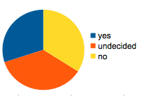
Here is what just happened:
- We took three numbers (two, actually), and exploded them into 130 times 200 three-byte pixels. Really good lossless image compressing somehow brings that back down to 6000 bytes and disk space is cheap, but still, consider the awesome power of a full office allowing us to turn three numbers into six thousand numbers.
- We added new information: yes is blue, no is yellow, and undecided is a super intelligent shade of orange. Yes and No meet at noon while the undecided seem to prefer non-office hours.
- The interaction between the top-to-bottom legend with the cute stacked little color bricks and the pie segments imply a counter-clockwise ordering.
Important or not, brains are good at learing things like that, consciously or not, and a little color goes a long way to lighten up a boring report, but maybe the readers have other things they could be doing with their minds?
By the way, the important differences between the values (ie: more undecided than no) has been all but obliterated by the all that other information (read: noise) we have added in the process.
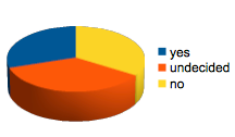
It gets better
Of coursem the two dimensional pie chart are not as silly as it gets. This same spread sheet software lets me create 3D pies!
The epitome of visual goofyness for the canned charts coming with OpenOffice, however, is the EXPLODED PIE, otherwise known as the donut chart.
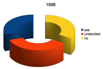
Please bask in its warm glow for a moment. Let its awesome dynamic power sink in while I assure you that this still is not as bad as it gets. In fact, the OpenOffice spreadsheet actually do contain many useful charts which, when used wisely, can help get the point across. In their default settings, they are also somewhat judicious in their use of visual elements, helping keeping the focus the data instead of the chart junk.
Less is More
So, what alternatives do we have here to represent these 2+ numbers. First, off, we could stay with the 3D theme but lose the colorful circular arrangement, instead putting them side by side.
By now, you have probably caught on to the fact that the fake 3D bit does not add anything other than:
- funny angles imply a position for the chart with respect to the viewer
- meaningless shading - are those pillars circular or ellipic? and if so, why?
- difficulty in using the scale to read back the numerical value
Good people have spent small parts of their carreer teaching spreadsheets how to appear they are being fake-3d-viewed from the upper left as opposed to the upper right. If you dont think that is sad, then how about you as a consumer or share holder paying their sallaries? But I degress... so let us lose the 3D for good.
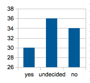
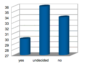
This now looks much simpler, but we notice a problem. Glancing at the chart shows us that we have twice as many yas as we have nays. In order for figure out what is really going on, we have to read at least two numbers on the left. If you had more than one of these charts in the same report, they all may have different scales on the left, requiring the viewer to re-learn the scale each time.
In order to have this chart give you the right idea at a glance, we ought to go with a zero base.
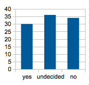
This is now pretty good. For some cases, this may be good enough. But we still have basically three bars. How can we make this even simpler?
Even Less is Even More
I alluded earlier the question of how many numbers we have here. Doe we have two numbers of three? The key here is that the pieces add up to 100%. And really, we are interested in the break-down of that 100%. A stacked bar graph is in order:
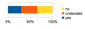
Now we have added colors back in again, along with their pixel and semantic baggage, but having the colors solves the problem of telling the difference between a 100% yes and a 100% no stack without having to introduce other visual aids.
One thing we need to fix, however, is that the most exciting color (the super intelligent shade of orange red) is used to draw urgent attention to the least exciting part of the data: the not-sure. A dull light grey is more appropriate for that.
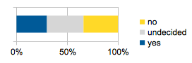
Yellow/Blue, btw, is more appropriate than Red/Green on account of color blindness statistics. Many other considerations go into picking colors for data visualization (e.g.: will this need to get printed out in black and white, for instance), but so far, this is not bad.
Cookie Cutter
Now that the data is in a 1-dimensional visual format, we can easily show more surveys without using up much more space by putting them side by side, using identical color coding and axis scale.
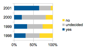
Nice, but it would make even more sense if the years were left to right, following the common convention (in our intended recipient's culture) of having time move from left to right.
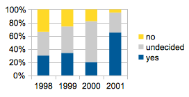
Some final tweaking is in order, like losing the ticks on the time axis, along with the bars and vertical bars on either side as our readers will know where the graphic ends and starts without those. Those little gray lines may not seem like much, but they should go because they do not add anything but visual noise, and visual noise takes away from the reader's ability to see what is important. Fortunately, the spreadsheet software is cooperative, and so we get the version we want without having to write our own.
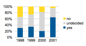
This chart shows 8 numbers in a space that would be occupied by an exploding 2-number donut, and it looks much less exciting. That is intentional, as the excitement should come from the fact that you can now clearly see the trend towards a world where more and more people realize how evil pie charts really are.
What next?
This is where we say: good enough. Visual noise is way down, the data is presented fairly concisely, and we did not even have to invent a new type of graphic or write our own code to draw the pictures.
Maybe next time, we should have a look at what alternatives we have for presenting this type of data outside of our stock spreadsheet,